
Eleventh Hour Rescue
Overview of Concept Project
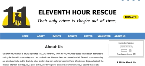
Eleventh Hour Rescue is a non-profit no-kill animal shelter with several locations in New Jersey. The organization is volunteer based and fully supported by donations.
In this 2-week sprint, I worked in a team of 3 to redesign their desktop and mobile sites.
The Challenge
Eleventh Hour Rescue’s website is inundated with text and multiple calls to action to donate. This results in a high bounce rate and lack of trust with users.
Objective
-
Increase trust with users by adjusting copy length and tone.
-
Streamline the path to make a donation.
Business Opportunity
Eleventh Hour Rescue can attract more donors and volunteers by highlighting their brand as a trustworthy organization.
Timeline
-
2 weeks
UX Team
-
Abby Nanquil
-
Min Park: UX Designer
-
Miles Rodriguez: UX Designer
My Role
-
UX Researcher
-
UX/UI Designer
Tools Used
-
Figma
-
Miro
-
Zeplin
RESEARCH
What do users currently experience?
To better understand our main users’ thought process and get a clearer idea of our target group, I interviewed recent donors and volunteers to identify general process and pain points in their charitable experience.
In this initial interview stage, we wanted to understand:
-
Intent: What motivates you to donate or volunteer?
-
Research: How do you find donation or volunteer opportunities?
-
Validation process: What decisions do you make before you donate or volunteer?
You can view the full user interview script here.
Users value mission, convenience, and trust.
These user interviews provided us with 3 key insights:

Mission is important
Users only want to give back to an organization that they feel strongly about.

Convenience is key
Giving back to the community can’t be a hassle or inconvenience to the user's schedule.

Trust is a must
The organization needs to be trustworthy before the user considers taking action.
What do users say about the existing site?
Once we understood what users were prioritizing in charitable activity, I then conducted secondary research through usability testing on the existing Eleventh Hour Rescue website.
Using the 3 insights from our user interviews, we set up tasks in each session to complete to understand:
-
If the user trusts this organization based on the information provided on the Eleventh Hour Rescue website.
-
How easy or difficult it is to make a donation.
75% of users do not trust Eleventh Hour Rescue for 4 reasons:
Scroll fatigue
There are so many sections and users felt it was an infinite scroll.
Text-heavy
Dense paragraphs with long line lengths overwhelmed the research process.
No validity
There were no anecdotes of real stories or photos, causing user doubt.
Confusing calls to action
Donate buttons led to different sites which created suspicion.
DEFINE THE PROBLEM
Who are our target users and what do they need?
Jane and Sasha feel overwhelmed with information overload and distrust when doing research on a shelter’s website.
How might we help provide Jane and Sasha with
the information they need to ease their research process?
I identified common themes with our research to define primary user bases, their needs, behaviors, pain points, and goals across all touchpoints in the charitable process.

Jane
Rockaway, NJ
Jane is a dog lover that wants to give back to the community. She has more time now that she's stuck at home, but isn't sure where to start, or even what level of commitment she wants to give back. After passing by the dog shelter two blocks from her apartment every day, she figured that organization would be a good place to start.
Goals
Find an opportunity where she can sign up/donate as quickly as possible.
Pain Points
Websites are packed with information and it’s hard to confirm its validity.
Needs
An easy way to identify trustworthy organizations.
Behaviors
Sees charities online through Instagram and does extra research on her laptop.
Sasha is a regular volunteer at her local animal shelter. She can’t adopt a dog since her roommate is allergic, so volunteering is the best way for Sasha to spend time with animals. Since we are in the pandemic, Sasha decided that it’s better to stay inside. However, she still wants to support shelters as much as she can.
Goals
Donate to a few animal shelters in her area.
Pain Points
Shelter websites are difficult to navigate because of confusing paths to give back.
Needs
Enough information on an organization to confirm its validity and gain trust.
Behaviors
Thoroughly researches an organization on her laptop, using sites like Act Blue.

Sasha
Kearny, NJ
What happens when Jane and Sasha try to make a donation?
They start off strong, but lose steam and ultimately give up.
My team and I identified opportunities to focus on our redesign by mapping Jane and Sasha’s journey through the different phases of the charitable giving process.

DESIGN A SOLUTION
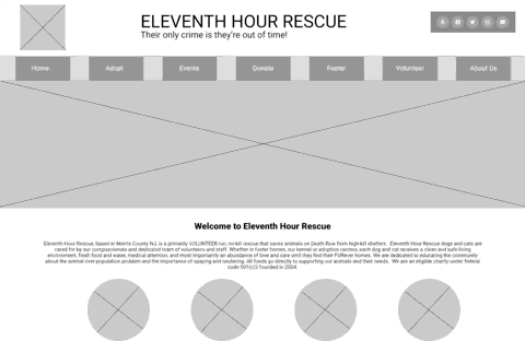
What does concise & trustworthy design look like for Jane and Sasha?
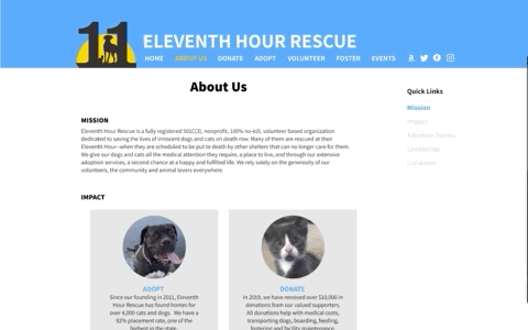
Prioritizing organizational impact & real stories in a navigable way on the About Us page.
I know there was a lot on the existing website that we could tackle. My and I conducted a feature prioritization to discuss must-haves and trade-offs for our design to fit the 2-week sprint.
I designed solutions on the About Us page to address the issues from the usability tests.
Scroll fatigue
Text-heavy
No validity
#1: Quick Links
Users can jump to the section they deem most important.

1
2
3
#2: Reduced Text
High-level details can help confirm validity sooner.
#3: Photos & Anecdotes
Photos and real stories helps create trust with users.
Streamlining calls to action in the most common areas.
Users called out the multiple Donate buttons citing confusion. I edited that down accordingly.
Confusing calls to action
#4: Reduce number of buttons
I kept the only path to donate through the primary navigation.
My updated concept resulted in a 100% success rate.
To validate our proof of concept for this new page, we ran more usability tests with 3 users.
3/3
Gaining trust
"I would love to see more adoption stories on this page"
Score: SUCCESS
-
3 / 3 users completed this task.
-
All users were excited to see real photos and read real stories.
3/3
Make a donation
"I kind of don't want to read anything here... and just donate"
Score: SUCCESS
-
3 / 3 users completed this task.
-
All users preferred that this page is actionable with minimal text.
Bring the design to life so Jane & Sasha can trust again.
I designed for desktop and mobile because Jane and Sasha use both interchangeably when looking to volunteer or donate.
The concept proved favorable results, so my team made sure to incorporate these designs in both mobile and desktop so that Jane and Sasha can easily move through either platform.

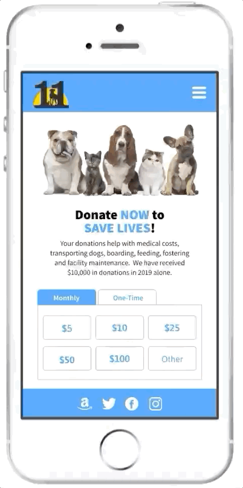
These updated designs increased trust by 75% from the original site.
Gain trust
Score: SUCCESS
-
4 / 4 users completed this task.
-
All users responded well to images and stories, but expected the photos to act as clickable links.
“It is nice to read about the people who are running the organization.”
Make a donation
Score: SUCCESS
-
4 / 4 users completed this task.
-
All users wanted to see they won't receive emails before they make the donation.
“I appreciate they will not send me emails because I get emails all the time.

We were ready to move forward with our developer handoff. Using Zeplin, we were able to provide our team of developers with a specifications document. Following our design sprint, we held daily standups for an additional 2-weeks with this team using Agile methodology.
NEXT STEPS & REFLECTIONS
What's next for this redesign?
Adjust microcopy in the donation flow & add a map and photos of locations in the About Us page for extra layers of trust.
Reflections
Finding the balance of text and imagery is tough. It takes a lot of testing and conversations with users to know what works best.
User testing from the very beginning had a lot of mixed opinions. Some folks were ready and willing to read through tons of paragraphs, while others were ready to close out of the window. I learned that we're not going to get an absolutely perfect approval of microcopy each time. As long as we continued to test, I know that we will be at least one step closer to the ideal stage.
Working cross-team required a lot of give and take.
This was my team’s first time working with developers, so we took our first standup to explain the UX process and the dev process. That conversation significantly helped establish rapport with our team. We maintained open communication during standup and through Slack, flagging any immediate issues to resolve quickly. No collaboration is without issues, so I am glad that both teams held each other accountable in every morning meeting!